Delve
A unique journaling app designed to unravel our thoughts and questions.
Mobile UXUI App Design

Introduction
The Problem
I love to practice deep thought, self-reflection, and introspection through journaling. Uncovering our thoughts is not only a mindful practice but it encourages curiosity and creativity. I prefer writing in a physical journal simply because it is very intuitive and free from distraction. When I don't have access to a pen and paper, I have found myself disappointed with my mobile journaling experience. Apps I have tried bombarded me with features and interactions that felt either unnecessary or overwhelming and simple note taking apps make it hard to organize my ideas because there is too much freedom. I believe there is a middle ground between these styles of apps. Although I personally don't see a replacement to physical journaling, there are benefits to digital forms of journaling which can help to ruminate our thoughts and questions.
The Solution
With Delve, I had three goals:
1. Allow users to uncover their thoughts naturally through call-and-response questioning
2. Provide a digital replacement for physical journaling
3. Create a simple, yet unique and expressive experience
Info
Client: Self-Led
Year: 2023-2024
Role: UXUI Designer, Product Designer
Tools: Figma, Adobe Illustrator, Adobe Photoshop, Pen and Paper
Process
1. Research

The apps 5 Minute Journal, Daylio, and Mind Node all contain aspects which contribute to the overall function of Delve. Despite not being direct competitors, the strengths listed overview some of the considered features in Delve. The weaknesses showcase how each of these apps are not fit for the goals of Delve and are aspects which were avoided during ideation.
My consensus from each of the apps were:
5 Minute Journal:
Utilize simple interfaces which will encourage daily use. Provide structure, yet don't overwhelm the user with an overly forced direction.
Daylio:
Incorporate colors and icons which link to the function of the information provided.
Mind Node:
Give users various forms of information visualization and allow divergence of thought paths.
2. Information Architecture
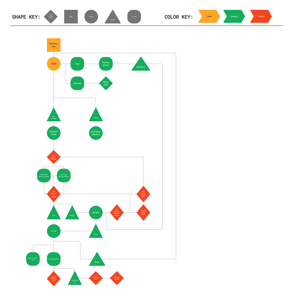
This information architecture and flowchart draft the important features included in the app. As a precursor to the wireframe process, this step allowed me to visualize what screens and steps were required.
The main screen has two sub-pages: calendar and tags for viewing previous entries in an organized manner. Also on the main screen is the starting point for creating a new thought flow. This thought flow leads the user into the main function of the app:
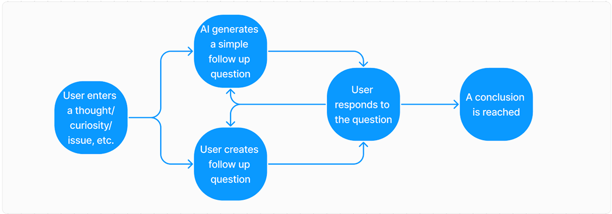
This overarching flow encapsulates the guided, looping cycle of self-questioning. In its base form, this loop provides the general structure for Delve.
3. Wireframes
With a solid foundation for the app, my next step was creating the most basic forms of the app screens. Beginning sketches on paper showcase my initial ideas for structuring the app.
Sketches


The goal from these sketches was to brainstorm the layout and functional approaches to creating an interactive user experience based on the information architecture. These basic forms gave me a strong standpoint for my digital low-fidelity designs.
Low Fidelity

These low fidelity designs are a strong basis for my finalized screens. The flow screens show how nodes pass into one another and how branches are formed and interacted with. The list view panel is shown in two states: in a split screen view and a full screen view. These screens show how users can view text in various formats.
4. Design System


Creating a design system before creating a high fidelity prototype of the app is an extremely crucial step for my workflow. With a solid foundation of colors and typography, I am able to create with order and adjust during the process of prototyping.
I chose to use orange as a primary color for this project as it evokes high energy, and warmth. The accent of red compliments the orange and assists in an attempt to grab the attention of the user. In unison, these colors are associated with creativity and an enthusiastic tone that will inspire the user.
5. Components

Utilizing components throughout the process of designing a high-fidelity prototype is essential for an organized and efficient workflow. Reusing these components is highly necessary and allows for later adjustment if necessary. When creating actions within the prototype, these components serve as a basis for creating interactive elements without the need for many linked interactions. For example, the nav bar seen in the center of the image above contains an animation where the illustration at the top follows which nav element is selected:
6. High Fidelity Prototype

The screens shown above represent all the nav elements and their representative screens. They follow the general layouts and design characteristics of the low fidelity wireframes but incorporate the components and styles previously described. The colors are used sparsely and aim to pose very specific elements as the focal points of the screens. For example: the home page encourages the user to create a new flow by having the orange and red "new thought/question" buttons as some of the only elements with such vibrant colors. The only other prominent use of color is in the navigation bar indicating the user is on the home screen.
Shown briefly in these screens and as you will continue to see throughout the flow portion of the prototype, orange represents thoughts, and red represents questions. This creates a clear distinction for the user how the app aims to guide them through this method of journaling.
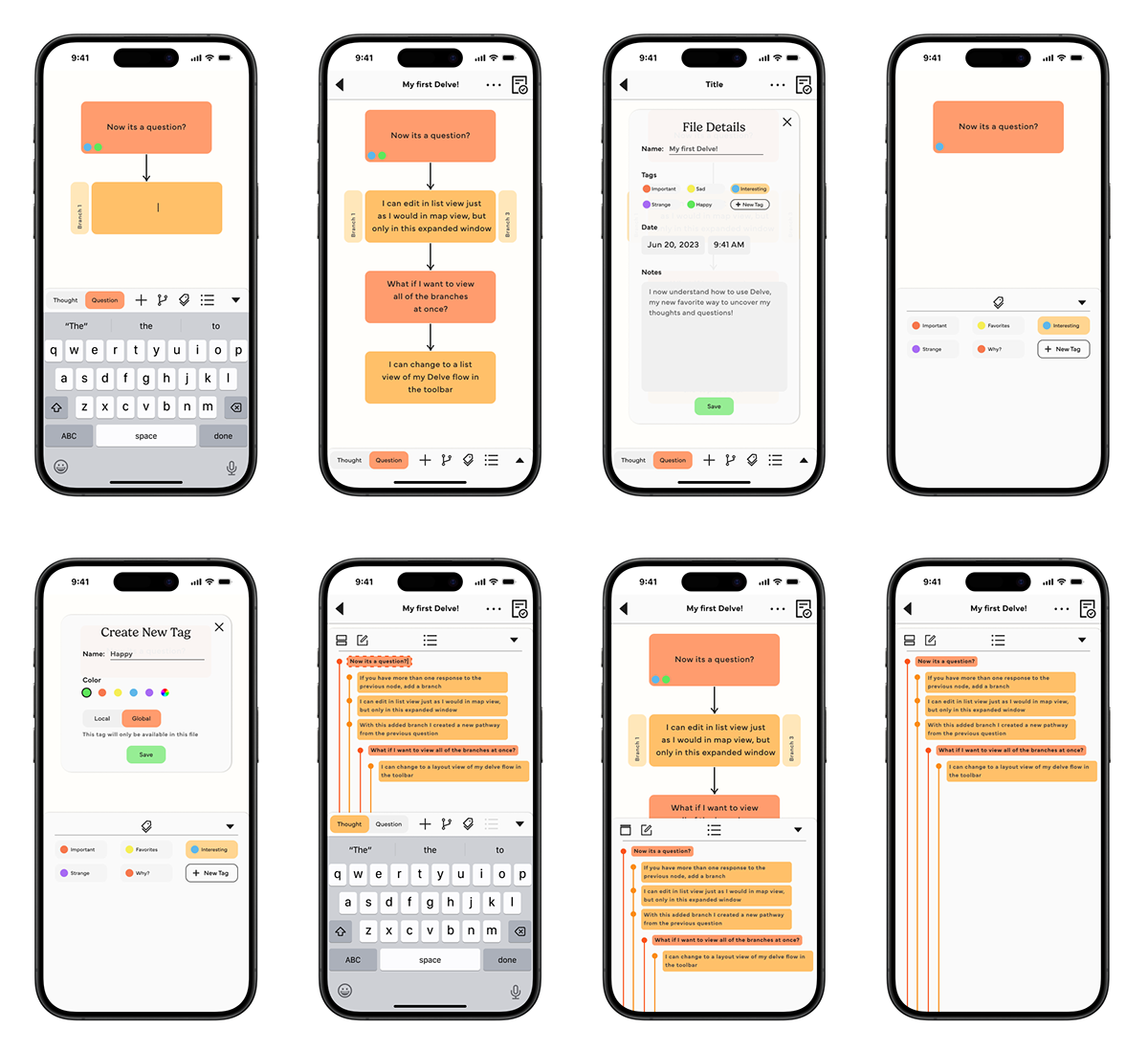
Shown in the screens above are various interactions for the general flow of the app. Users are prompted to enter thoughts and questions in succession and from there can create branches, tag their nodes, and see an overview of their created path.

The action bar (shown above) is an important part of the overall creation and editing of nodes. Along the bar from left to right users can: choose the type of node, add new nodes, add branches to nodes, tag nodes, and switch to a list view.
In the iteration section below, there is a complete version of the high-fidelity prototype which includes interactions that showcase a general user experience.
6. Iteration
After prototyping the necessary screens as seen in the previous section, I connected the various interactions. Seen below is the final designed product of Delve where you will be prompted to create a new path beginning with a thought on the home screen. You will progress through a linear example of creating a new path and once reaching the end, you can navigate the various screens freely.


